

Many businesses assume that better email marketing means more.
More design. More sections. More graphics. More animations. More content.
The logic seems reasonable. If an email contains more information, more visuals, and more effort, it should perform better.
In reality, the opposite is often true.
Some of the highest-performing emails are surprisingly simple. They don’t rely on complicated layouts or advanced design tricks. Instead, they focus on clarity, relevance, and making it easy for people to understand the message.
The reason is simple: people don’t read emails the way marketers think they do.
Most people don’t read emails
They scan them. Think about how you check your inbox.
You probably don’t open an email and carefully read every sentence from beginning to end. Most people quickly scan for key information and decide within seconds whether the email is worth their attention.
This is especially true on mobile devices, where screen space is limited and distractions are everywhere.
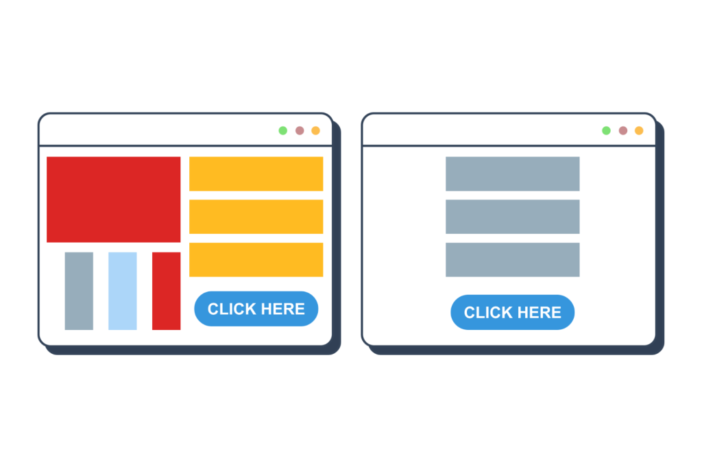
When an email is packed with:
- multiple sections,
- competing messages,
- large blocks of text,
- and several calls-to-action,
people often don’t know where to focus.
Instead of creating engagement, complexity creates friction.
Simplicity reduces mental effort
Every decision requires energy. When someone opens an email, their brain immediately starts asking questions:
“What is this about?”
“Why should I care?”
“What am I supposed to do next?”
The easier it is to answer those questions, the more likely people are to continue reading and eventually take action.
Simple emails reduce cognitive load. They make the message obvious. They remove unnecessary distractions and allow the reader to focus on what matters.
This is one of the biggest reasons simple emails often outperform more elaborate designs. The easier something is to understand, the more likely people are to engage with it.
Clarity beats creativity
Many marketers spend a lot of time trying to make emails look impressive, which is not as important as you may think.
An email that clearly communicates one idea and one action will often outperform an email that tries to communicate five different things at once.
This doesn’t mean design is unimportant. Good design absolutely matters.
But good design should support communication, not compete with it. The purpose of an email is to help people understand and act, not to showcase design skills.
Mobile first
Today, the majority of emails are opened on mobile devices. This single fact has changed how effective email marketing works.
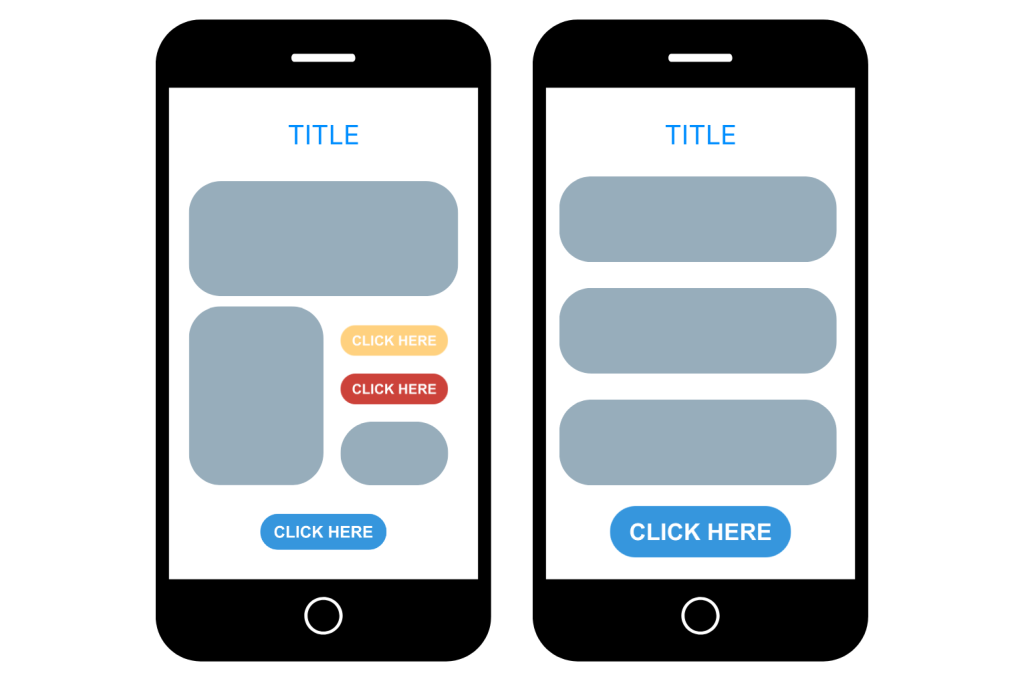
Complex layouts that look great on a large desktop monitor can become frustrating on a phone. Small text, multiple columns, oversized images, and crowded sections often create a poor reading experience.
Simple emails adapt naturally to mobile. Short paragraphs, clear hierarchy, generous spacing, and focused messaging are easier to consume on smaller screens.
As mobile usage continues to grow, simplicity becomes even more valuable.
Simplicity feels more human
There is another reason simple emails perform well.
They often feel more personal.
Many highly designed emails feel like advertisements. Readers immediately recognize them as marketing content and become more defensive.
Simple emails, on the other hand, often feel closer to normal communication. They feel less like a company speaking at someone and more like a company speaking with someone.
This subtle difference can have a significant impact on engagement. People generally respond better to communication that feels authentic and approachable.
Complexity creates more opportunities for failure
Simple emails don’t just perform better. They’re also easier to execute consistently.
Complex emails require:
- more design work,
- more approvals,
- more testing,
- and more revisions.
Every additional element introduces more opportunities for delays, mistakes, and technical issues.
Simple emails are easier to create, easier to review, and easier to send.
This allows businesses to focus more on consistency and value instead of production. And consistency is often one of the biggest drivers of long-term email success.
What simplicity actually looks like
Simplicity is intentional, not boring.
A simple email usually has:
- one main message,
- one clear objective,
- one obvious next step.
Every element serves a purpose. Nothing exists simply because there was extra space to fill. The goal is not to remove everything, but to remove everything unnecessary.
Final thoughts
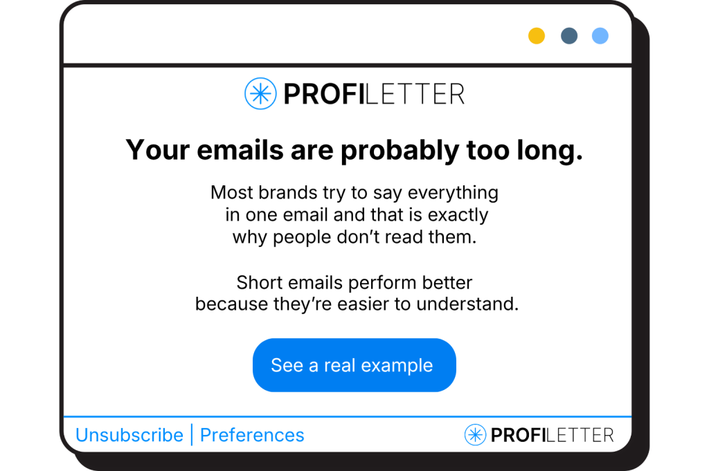
The longer we work with email marketing, the more we realize that success rarely comes from doing more. It usually comes from making things easier for the reader.
People don’t open emails hoping to admire the design or analyze the structure. They’re simply looking for something useful, something relevant, or something interesting.
The brands that understand this tend to communicate more clearly, focus on fewer things at once, and ultimately make it easier for their audience to engage. And that’s often where the best results come from.